|
The once insurmountable traditional media MOAT has been under attack for the past half-decade. In his 1991 annual letter, Warren Buffett described the difference between a franchise and a business. An economic franchise arises from a product or service that: (1) is needed or desired (2) is thought by its customers to have no close substitute (3) is not subject to price regulation The existence of all three conditions will be demonstrated by a company's ability to regularly price its product or service aggressively and thereby to earn high rates of return on capital. Moreover, franchises can tolerate mismanagement. Inept managers may diminish a franchise's profitability, but they cannot inflict mortal damage. Media Franchises For several decades leading up to the mobile era, media businesses - especially TV – were economic franchises. Great video entertainment was highly desired, and there was no close substitute. TVs share grew while radio and newsprint declined. Social media and user generated content did not exist. Shows such as Friends, or Seinfeld carried the entire network. It was Must-See-TV. As Buffett mentioned in his letter, a desired product without a substitute in a unregulated market has pricing power. And media possessed significant pricing power. Media companies also tapped into the desire for Live sports to increase the volume of sports programming, introduce new sports channels, and raise prices. However, it had another ace in its back pocket. It was an attractive industry structure. Attractive Industry Structure In the 90’s, TCI managed by John Malone, was the dominant cable company. However, after its sale to AT&T in 1998 and the later spin-off of TCI assets, the Cable market fragmented. Multiple cable/satellite companies shared the market. While some had dominant local positions, no one player had a dominant national position. This fragmented nature of cable played into the hands of media companies. They took full advantage of using their supplier power on their distribution partners. Opaque and Ever Rising Prices As time went on, the cable bundle kept getting larger, and the affiliate fees kept rising. When media companies took price increases - Cable companies – took the wrath from consumers. The cable bundle pricing was notoriously opaque. Sports leagues negotiated larger contracts. Sports programmers such as ESPN passed on price increases onto cable companies, who passed it on to the end consumer. While consumers felt the rise of cable bundle prices, the attribution of the price increase was mostly unknown to the consumer (I.e. what channels in the bundle are driving the inflation.) Chart 1 - Cable vs Overall Inflation 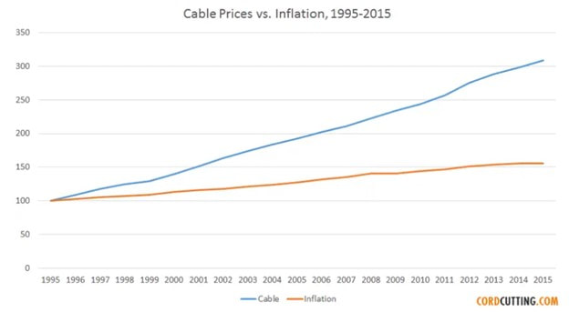 Bundles Reduce Churn Additionally, the bundled nature of the cable product and the lack of substitutes meant it was an all-or-nothing proposition. There was no viable substitute. Therefore, customer churn was minimal, even for the mediocre media properties. (Cable bundle churn was ~2% per month vs 7-8% per month for streaming.) Consumers paid for channels they did not think existed! Non-sports watching households subsidized the sports watching households. Sports programming benefitted the most from the bundle. Low Marginal Costs Media businesses have low marginal cost. The cost of producing a show is fixed, irrespective of the number of households watching it. Therefore, as the number of households with cable TV grew, so did the profits of media companies. This was the golden age of media and the Cable bundle was the back-bone. However, all good times must eventually end. The emergence of the mobile era. You Tube and user-generated content, and the rise of Netflix changed the landscape. As the sheer volume and quality of substitute content grew, the need for traditional media shrunk. The alternatives were either free (ad-supported) or in Netflix’s case, had low prices. Therefore, Cable’s annual price increases became untenable to consumers. Media businesses slowly started the transition from Franchises to Businesses as chord-cutting accelerated. Chart 2 - No. Of. Pay TV U.S. Households 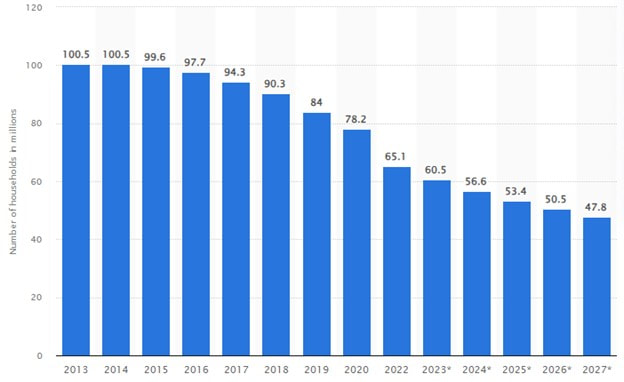 Source – Statista In his letter, Buffett also described a ‘business’ as "A business" earns exceptional profits only if it is 1) the low-cost operator 2) if the supply of its product or service is tight. Tightness in supply usually does not last long. With superior management, a company may maintain its status as a low-cost operator for a much longer time, but even then, unceasingly faces the possibility of competitive attack. 3) And a business, unlike a franchise, can be killed by poor management. Rise Of Netflix As the market power of Netflix and the valuation of its stock grew, so did the desire for every Media business to build a streaming offering. In came Disney +, Peacock, Paramount +, and HBO Max. Streaming Is A ‘Business’ Streaming is expensive. Binge watching shortens the shelf-life of media assets, creates high content costs, and has high customer churn. Remember, consumers want the next hit show, aren’t locked into a bundle, and can cancel anytime to move to another service. A Vicious Cycle To help reduce the burden of content creation, media businesses started taking away good content out of the cable bundle (DWTS only available on Disney +) in favor of streaming. While this recruited new customers and retained existing customers for steaming services, taking away content reduced the already weak value proposition for the cable bundle. Additionally, to offset the volume loss of chord-cutting house holds, media companies kept raising prices. Higher prices combined with a lower quality offering led to more chord cutting. Moffett-Nathanson, the thought leaders on Media and Telecom, describe this phenomenon as the vicious cycle. While these moves maximized short-term profits, it came at a large long-term cost. 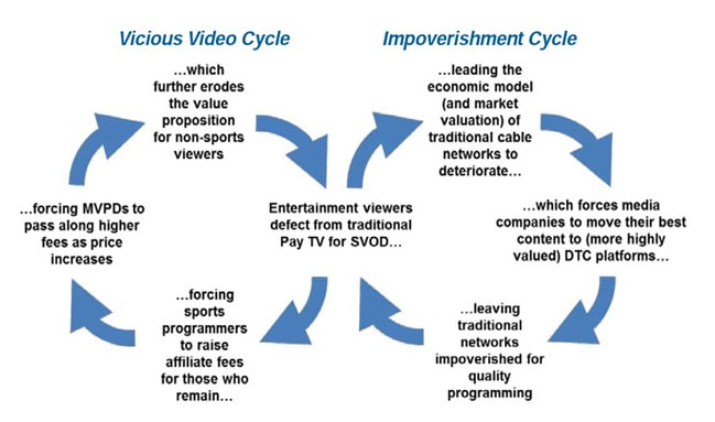 Source – Moffett Nathanson
The Disney Transition After his return to Disney, CEO Bob Iger is accelerating Disney’s transition path from a business dependent on the cable bundle to one that is direct to consumer (DTC). This involves adding more debt to purchase the remaining piece of Hulu (owned by Comcast), accelerating the direct-to-consumer path for ESPN, and potentially divesting the ABC network and TV station business. Although Disney is the strongest brand in traditional media, has a highly differentiated parks business, a scaled DTC business in Disney +, a sports offering with ESPN, the earnings uncertainty through this transition is very high. Poor Industry Structure and Declining Pricing Power The supplier power that was once a hallmark for Media has eroded. Simply, Media has extracted all the profits out of the TV value chain. Today, the Cable companies have strong broadband segments as their anchor businesses, with minimal and declining video business profitability. With nothing to lose, they are willing to walk away from the video business. The resolution of the recent Disney-Charter dispute where Disney had to give into Charters’ demands is a microcosm that Media has lost its leverage. The Final Straw? The cable ecosystem has been shrinking at a ~5% annual rate for several years. The revenues of media companies are flat because they have taken commensurate price increases to offset declining households. If a major sports piece such as ESPN leaves the bundle as it transitions to DTC, it maybe the final straw for the bundle as chord cutting accelerates. You Tube TV, as well as Hulu TV (owned by Disney) are the likely winners as Virtual multi-channel video programming distributors (vMVPD). From A Franchise to A Business Where does this transition from the cable bundle to streaming leave tradition media? I’d argue worse off. This leaves the entire Media landscape as one with low desirability, too many substitutes, low pricing power, and poor industry structure. While the cable bundle had incredibly low churn and strong leverage over its distributors(Cable/satellite companies), the DTC industry structure has higher costs and significantly high churn. It was a good run for traditional media. Good times never last forever.
1 Comment
When interest rates and currencies move too fast, equity markets stumble. Is it a harbinger of something bad? Read on. Japan For the past three decades, The Bank of Japan (BOJ) has kept its interest rates low by buying its own bonds. They were desperate for higher growth and higher inflation. In 2Q, Japan had strong growth. With signs of rising inflation, the BOJ has shown a decreasing appetite to control rates. As a result, the Japanese 10-year increased from 0.35 to 0.65% (red arrow in Chart 1). This pushed up rates for all developed economies. Markets are inter-connected. Chart 1 - Japan 10 Year Yield  Source - Bianco Research Weak China and the Dollar After the initial re-opening bump, the Chinese economy has continued to weaken. While the Chinese authorities are slowly adding monetary stimulus - it is measured - and so far seems inadequate. Markets are asking for bold actions. Foreign private investment is leaving China, and reports of real estate default are adding to the cautious sentiment. Global caution helps the U.S. dollar. The U.S. is also one of the clear beneficiaries of capital flight out of China. To buy U.S. assets, investors have to buy dollars first. This leads to a rising U.S. Dollar. In the short term, a strong dollar is a risk-off signal which brings more selling. Chart 2 - S&P 500 & the Dollar 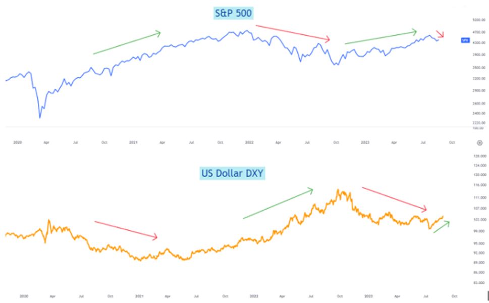 Source - Latticework Investments Strong U.S. Growth While China is sputtering, the U.S. economy is accelerating. Contrary to all expectations, the U.S. economy is growing >3% in 3Q. The 10-year average is 2%. Strong consumption and deficit spending are pushing up U.S. interest rates. The US 10-year rate is close to 4.3%. Rising interest rates, if supported by better growth, isn't a negative by itself. However, high rates are making home and auto purchases less unaffordable. Strong Earnings 2Q earnings were 8% better than expected (chart 3) and above the 5% median surprise of the past 15 years. Sales were 1.5% above expectations. Improving real incomes (wages growing faster than inflation) is translating into improving retail sales. Most large retailers have reported sequentially improving sales from May into August. After a tough 2022, earnings momentum is building. Historically, once earnings momentum builds, its lasts longer than a quarter. Chart 3 - S&P Earnings Surprise 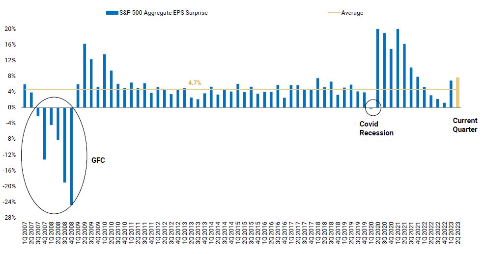 Source - Morgan Stanley Seasonal Movements Over the last ten pre-election years, the S&P has corrected in August, for different reasons. In each case, the sellers have come back into the market only to buy back at higher prices (chart 4). With healthy levels of skepticism regarding the future, will 2023 repeat the historical pattern? Stay tuned. Chart 4 - S&P Pre-Election Year Seasonality 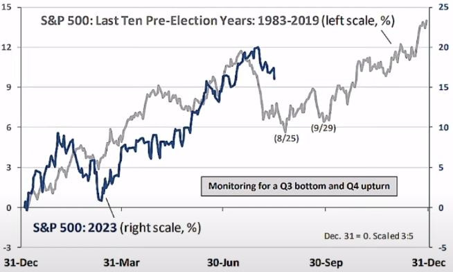 Source - Oppenheimer
 Image created using Adobe Generative AI Intelligence Factories & The Arc of Technology Adoption Generative AI is a new Computing platform. Intelligence factories are the outcome. However, let's go back 7 decades to figure out how we got here. The mainframe computer was invented in the early 1950s. It was a major breakthrough in computing that enabled data processing at a scale that humans couldn’t comprehend. IBM commercialized the mainframe soon thereafter. There was one large hurdle to mass adoption. Price. A mainframe cost millions! Governments were the early adopters. Academic institutions soon joined in with hopes of accelerating research. Three decades later, IBM was once again the leader in commercializing the Personal Computer (PC). The PC finally introduced affordable computing to small businesses and consumers. Productivity increased soon thereafter. 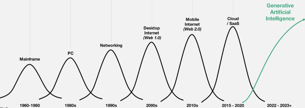 Source – Coatue Presentation
Hardware vs Software Adoption Hardware innovation is introduced at the high end. It’s expensive. The Tesla Roadster was a Sports Car. Then came the Model S. The Model 3 is the mass version. There is likely a Model 2 in the future. The Apple Vision Pro is prohibitively expensive and only compelling to early adopters. However, if history is a guide, prices will fall and future versions of this device will be household items. To grow, businesses drive down the costs of their manufacturing processes. As volumes grow and efficiencies kick in - prices drop further – stimulating even more demand. This virtuous cycle leads to mass market adoption. Seven decades after the invention of the mainframe, we are entering the world of Generative Artificial Intelligence (Gen AI). Gen AI is standing on the shoulders of the internet, mobile, cloud, machine learning, and neural networks. However, the Arc of Innovation has flipped. The masses had to wait three decades for the PC. Similar Generative AI adoption took three months. There are two simple reasons: 1) Ease of availability, 2) Low costs. Microsoft (Bing AI) and Google (Bard) have made their versions of Gen AI available at no cost. Software adoption works in the polar opposite direction to hardware adoption. It starts at the grassroots. Consumers adopt it first. Small businesses come in next, and Governments are the laggards. Intelligence Factories Consumers and corporations are sitting on a massive inventory of data. Data centers and cloud computing provide industrial-scale processing capability. However, programming was difficult for most and thus a big hurdle in leveraging data in order to unlock business intelligence. With Gen AI, we can build intelligence factories on top of our current infrastructure to unlock trapped intelligence. Instead of programming languages, the inputs are natural language prompts. Gen AI is disrupting programming language. English, or natural language, is the way forward. Gen AI writes the code for us. This ease of use will pull every consumer and corporate employee to leverage these intelligence factories. It will make all of us more productive. If PCs were a great tool, productivity enhancements from Gen AI over the next decade should be much greater. While every technology has its drawbacks, the positive economic impact over the next decade will be substantial. Gen AI has turned the Arc of Technology adoption upside down. It is a powerful new computing platform. Intelligence factories are the outcome. If you’ve taken summer driving trips with kids, then you have heard these five words, repeatedly. Are we there yet? Most investors have also been asking a similar question. Is a recession here yet? After multiple bank failures in March, even I fell for it, to be honest. However, after two bad months, economic data has bounced back. ‘The Fed has raised interest rates above 5% and therefore a recession is imminent’ view has so far proven to be incorrect. Our economy just isn’t as interest rate sensitive, as in the past. However, there are other factors also at play. Here are 5 important economic metrics that indicate the U.S. economy is steady. Chart 1: Consumer Surplus: Income (white line) is rising faster than expenses (orange line) 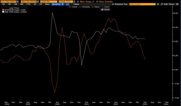 Source – Bloomberg Inflation is falling, and falling faster than most believe. Falling inflation provides a big surplus to the engine of the US economy, the consumer. As you can see in Chart 1, while wages are growing by 4% (white line), inflation is now growing less than 2% (orange line). Chart 2: U.S. Savings Rate Is Growing Again 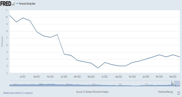 Source – St Louis Fed The savings rate fell all throughout 2021 and 2022. Rising inflation had a big part to play as households had to support their spending by tapping into savings. However, that trend changed late in 2022. Households are building their savings pool again, explained in Chart 1. This is a healthy and sustainable development. The growing narrative that the consumer is quickly running out of savings cannot be validated anymore. Chart 3: Employment is Strong 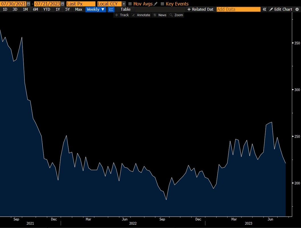 Source – Bloomberg Despite rising layoffs, unemployment claims (Chart 3) - a leading indicator that signals a future rise in unemployment - are at record lows. Therefore, laid-off employees are finding new jobs rather easily. While bank failures led to a rise in claims and job losses, they quickly reversed. Historically, a spike in claims above 300,000 is a marker for trouble in the labor market. Today, we sit at historic lows. Chart 4: Restaurant Sales Are Steady 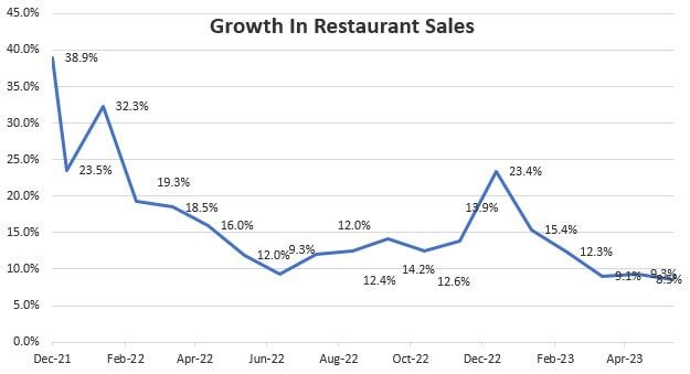 Source – Census.gov Jobs are plentiful, wages are rising, and grocery prices are falling. Restaurants are a beneficiary of this consumer surplus, and sales are steady. Eating out spending is the best coincident indicator of our economy. Executives of large casual dining chains I speak with regularly indicate no change in consumer behavior despite large menu price increases. Chart 5: Budget Deficit Is Growing 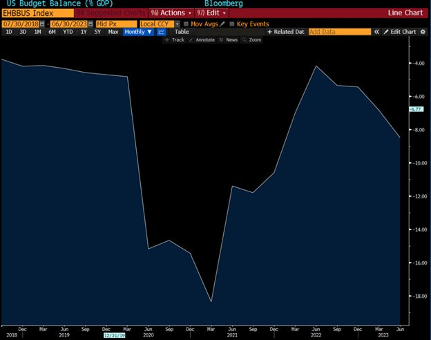 Source – Bloomberg
The Federal Govt. announced a decade-long plan to invest $2 Trillion to address infrastructure, renewables, CHIPs, and electrification. This is a massive and sustainable stimulus to the economy. The initial funds started to seep into the economy starting 2H 2022. Infrastructure investments have a large, offsetting effect on interest rate increases. As a result, the deficit has grown from 4% to 8% over the past year. Over the long term, this is negative for the U.S. dollar. However, this also means more construction, more high paying field jobs, and faster GDP growth over the rest of the decade. Today, the U.S. economy is steady. With inflation much closer to benign levels than most believe, the likelihood that the Fed is done with rate hikes is high. In this case, most investors are asking the wrong question. The question most should ask is, how high can this bull market go? Markets are complicated. Simplify and keep it REAL. Here is how… REAL is a practical and simple to follow risk-on/risk-off framework to monitor market conditions. REAL is an acronym to monitor changes in Rates, Earnings breadth, Availability of credit, and Liquidity waves. Consider this a dimmer, not an on-off switch. When most components are worsening, be fearful. Vice versa, when most components are improving, be greedy. Let’s dive in. Rates: A practical risk-free rate is the 10-year U.S. treasury. As the 10-year goes up, future cash flows are worth less and vice versa. Higher rates make big-ticket purchases less affordable. After a meteoric rise, the rate of interest rate rise has slowed. However, the high absolute levels of rates are a headwind and likely to slow economic activity over the coming months. NEGATIVE Chart 1 - Nominal and Real U.S. 10 Year Treasury Yield 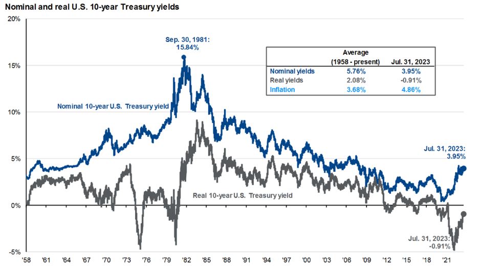 Source – JP Morgan Earnings Breadth: When earnings for a wide range and breadth of companies in disparate industries are rising, economic and market expansion has momentum. After bottoming late last year, earnings revisions are positive and revision breadth is improving. The number of companies and industries where earnings are improving is also rising. This is a positive development and suggests the market advance is durable. POSITIVE Chart 2 - S&P Earnings Breadth 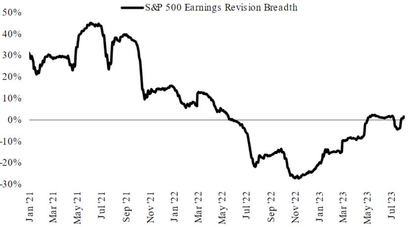 Source – Morgan Stanley Availability of Credit: Credit is the grease that keeps the economic wheel turning. As economic uncertainty rises, banks reduce the amount they lend, and charge higher rates. Individuals and businesses with lower credit scores find it harder to get loans. Similarly, investors demand an above-average compensation to own risky investments. This is reflected in rising credit spreads or rising cost of money (see chart 3). The higher spread eventually cascades all the way to every corner of the market, regardless of the underlying quality, and compresses the valuation of all assets. When credit becomes scarce, the grease dries, the economic wheel stops turning, and markets fall. Credit spreads peaked late last year (chart 3) and have continued to drop – despite bank troubles. This is a positive development and indicates credit is more freely available compared to 2022 and the cost of high-risk loans has fallen. POSITIVE Chart 3 – Credit Spreads 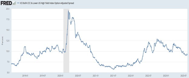 Source – Federal Reserve of St. Louis Liquidity waves: Liquidity moves markets. When the Fed provides liquidity via Quantitative Easing, investors rush in and take risk. Equity market goes up. When the Fed stops, the opposite happens. In 2022, liquidity contracted at the fastest rate in history. Now, while liquidity is still negative (chart 4), we are improving from deeply negative levels and conditions are ‘less bad’. On an absolute basis, liquidity is well above pre-covid levels. NEUTRAL Chart 4 - Liquidity 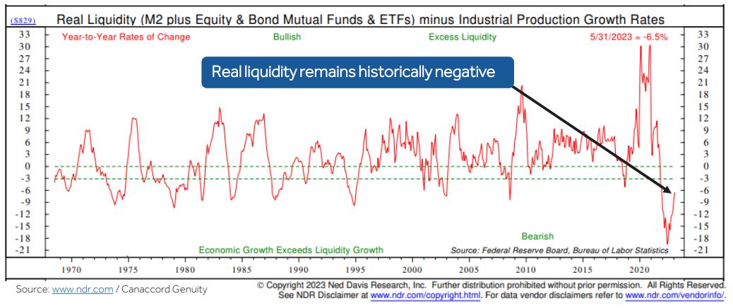 Source – Canaccord Genuity
Two out of the four components of the REAL framework are positive and improving, one is negative, and another neutral. Remember, this is a dimmer, not an on-off switch. When most components are worsening, be fearful. When most components are improving, be greedy. Today, with more positives than negatives, the REAL framework reflects fundamental improvement. Markets are complicated. Simplify and keep it real.  What were the odds the Federal Reserve could raise rates dramatically, reduce inflation, minimize job losses, AND preserve overall demand? Low to none. However, the data suggests that the odds of success are rising dramatically. Demand is resilient, wages are falling, inflation is falling faster, and jobs are STILL plentiful. We are in Goldilocks. Goldilocks is an economic environment where both demand and supply are in balance. Not too hot, not too cold. Goldilocks is important because the Fed now believes it has regained control of inflation, and it can slowly pivot to re-focusing on preserving demand. Is Goldilocks temporary? The economic pessimist would point to 1) interest rate increases have a lagged effect and 2) the negative impact on the economy will be evident in the 2nd half of 2023. The leading indicators are pointing to a slowing economy. Large rate increases make the slowdown unavoidable. However, as inflation slows, the odds of a less severe slowdown are rising dramatically. Chart 1: Growth In Restaurant Sales  Growth is resilient, so far Most macroeconomists look at GDP projections to understand growth. While GDP is growing, and growing faster than most estimates, investors should look at more meaningful measures. One such measure is overall eating out sales. When consumers are unsure about the future, one of the first places where we cut back is eating out. Eating at home is cheaper. As chart 1 indicates, restaurant sales growth over the past six months is unchanged. When the outlook becomes uncertain, restaurant sales will be the first to signal change. Chart 2: Atlanta Fed Sticky CPI ex rent at 2% (3 month annualized)  Inflation is falling Inflation was clearly a problem. The global economy encountered a once-in-lifetime demand and supply shock – at the same time. However, that is in the past. The money that was pumped into the system has made its way in, and out. Demand is back to normal. The supply shock from a total shutdown and reopening is also behind. Therefore, inflation is falling and falling faster than most are willing to believe. The leading indicator for inflation is the Atlanta Fed sticky CPI excluding rent. The latest reading shows CPI down from 8% to 2%. The Fed believes 2% is the ideal level for inflation. More details on inflation are here. Chart 3: Unemployment Claims (blue) and Job Openings (white)  Despite rising layoffs, employment is steady Corporations right-size their cost structure when they expect future profits to be lower. One way to right size is to reduce the number of employees. Not a day goes by without reading layoff announcements by major corporations. Despite rising layoffs, unemployment claims (blue line) - a leading indicator that signals a rise in unemployment - are at record lows. Therefore, laid-off employees are finding new jobs rather easily. New job openings (white line) are close to all-time highs. While most leading economic indicators are at recessionary levels, employment claims are the key measure. A low level of claims indicates employment is not an issue, so far. The economic silver lining in rising layoffs – if there is such a thing – is layoffs are reducing the pressure on wages increases. This is the Fed's goal! Chart 4: Wages (yellow) are rising faster than inflation (red)  Net savings deficit to surplus
Consumer spending drives the economy. For this engine to keep moving, jobs must be plentiful, and incomes must grow more than expenses. In 1Q22, inflation was rising faster than wages (red arrow), which was a headwind for savings and spending. However, that has reversed. Wages are now growing at a faster rate than expenses (green arrow) which creates consumer surplus. The Fed's goal is to reduce inflation by cooling wage growth, without causing large job losses. As unlikely as this may have been last year, demand is resilient, wages are falling, unemployment claims are falling, and inflation is falling faster. This is GOLDILOCKS. The probability is rising that the Fed is less foe and more friend in 2H23. Markets are rallying in response to goldilocks. The sustainability of goldilocks is a question that only time can answer. Until then, enjoy it. -- This material does not constitute an offer or solicitation to purchase an interest in Latticework Partners, LP (the "Fund"). Such an offer will only be made by means of a confidential offering memorandum and only in those jurisdictions where permitted by law. An investment in the Fund is speculative and is subject to a risk of loss, including a risk of loss of principal. There is no secondary market for interests in the Fund and none is expected to develop. No assurance can be given that the Fund will achieve its objective or that an investor will receive a return of all or part of its investment. This material contains certain forward-looking statements and projections regarding the future performance and asset allocation of the Fund. These projections are included for illustrative purposes only, are inherently speculative as they relate to future events, and may not be realized as described. These forward-looking statements will not be updated in future. A Price-Earnings ratio (P/E) is a shortcut. It has two simple inputs: 1) Price and 2) Earnings. Can valuing a market, or a stock be that simple? No. Markets are complex. Read on. While the price and underlying earnings are important, understanding the context is paramount. Movement in interest rates, understanding of economic cycles and earnings, prevailing investor sentiment, and sector composition are important inputs into building the context. However, interest rates are the lynchpin. Let’s start there…. Chart 1: S&P P/E and Interest Rates 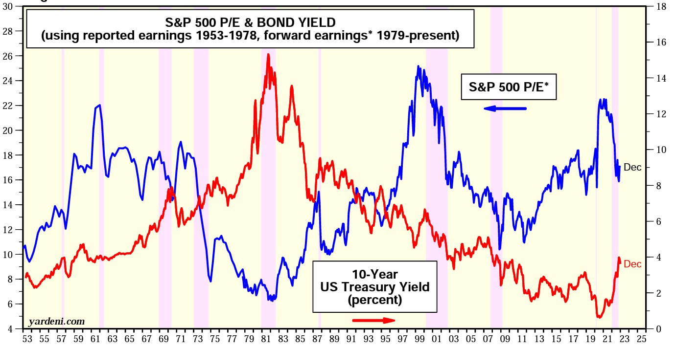 Source – Yardeni.com Interest Rates: The P/E ratio is inversely proportional to interest rates. The present value of future cash flows changes, as interest rates change. For this discussion, let’s use the 10-year treasury yield (red line) in chart 1 as the interest rate. Therefore, when interest rates are high - the P/E ratio is low - and vice versa. In the 1970s when inflation and interest rates were bordering on double digits, the P/E ratio was close to 10. Despite the low P/E, markets were flat for a decade in the '70s, because rates kept rising. During 2015-20, inflation was non-existent and interest rates globally were low. In Europe, interest rates were negative. It should come as no surprise, the P/E ratio was close to 20. Despite the high P/E, markets did well because rates fell. Therefore, it is important to understand the P/E ratio in the context of 1) where interest rates are in the present relative to history, and 2) where they may be going. Chart 2 - S&P and Earnings Growth 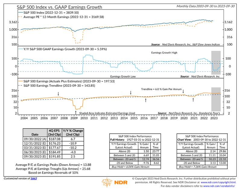 Source – Ned Davis Research Economic Cycles and Change in Earnings: As earnings growth accelerates, the P/E ratio expands. The acceleration gives investors a higher degree of certainty about the future. Therefore, investors pay up, which is reflected in a higher P/E. Typically, earnings rise for several years after a recession. Therefore, the P/E expands (grows) at the depth of a recession in anticipation of a new economic cycle. The reverse is also true. As earning growth decelerates after a long economic expansion, the P/E ratio contracts as the likelihood of bad economic outcomes rise. Chart 3 – S&P vs S&P Earnings 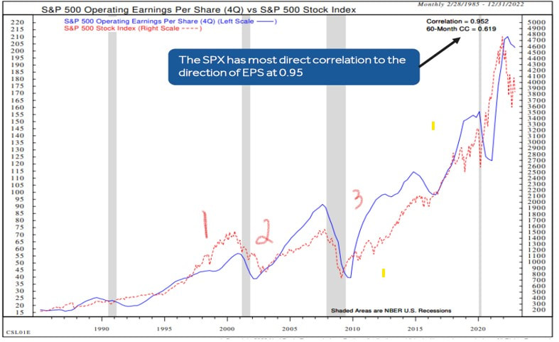 Source – Canaccord Genuity, Ned Davis Research Investor Sentiment: There are three unique periods in recent history when investor sentiment played a large role in valuation. 1995-00 was a period of euphoria. Investors believed the internet was transformational and therefore, no price was high enough. This ended with the Dot Com crash. On the contrary, the 2001-04 period was an outlier with low valuation despite good earnings growth for two reasons: 1) 9/11 created societal uncertainty, and 2) major corporations (Enron, WorldCom, and Tyco) were embroiled in accounting scandals and corporate dishonesty. Investor belief in the system eroded. Similarly, 2009-2013 was an aberration for P/E ratios. Despite solid earnings growth and historically low-interest rates, the P/E ratio was historically low. The global economy was recovering from the Great Financial Crisis. Investors lacked confidence in future growth, which was reflected in a low P/E. Chart 4 – Historical S&P Sector Composition 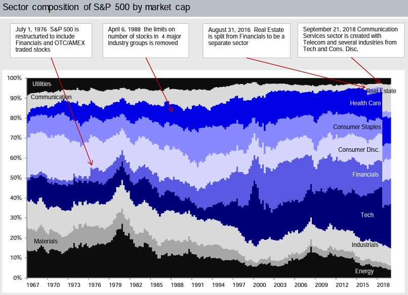 Source – DWS Investment Management The Composition of the market: Sector weights ebb and flow and impact the overall P/E. Like in 2000, technology was the largest component of the market in 2021 (chart 4). Cyclical sectors such as Energy, Industrials, and Materials were at historical lows. In 2006, it was the opposite. Energy, Industrials, Materials, and Financials had a significantly larger weighting in the S&P. Cyclical sectors have a lower P/E ratio. Simply, they are cyclical, and investors pay less for future earnings due to higher uncertainty. Therefore, comparing the S&P P/E across history without normalizing sector weights is a mistake. It's comparing apples to oranges. Chart 5 – Change in S&P Forward P/E 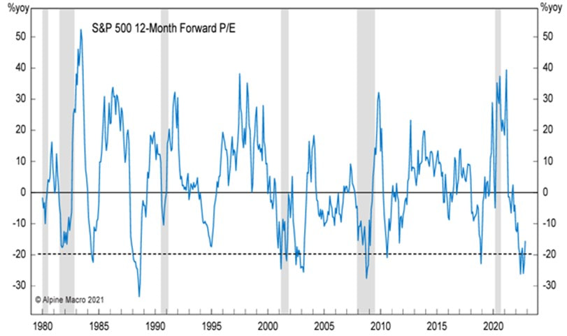 Source – Alpine Macro
Changes In P/E: In 2022, as rates catapulted from 1% to 4.5%, the S&P P/E ratio had one of the most significant declines in modern history (chart 5). The only historical period in the past 40 years when the drop was more severe was the crash of 1987. The shaded bars in chart 4 are recessions. Outside major disruptive events, after a large fall, the P/E rises. This historical context challenges the current consensus thinking that P/E will drop further as earnings continue to decrease. Therefore, if inflation collapses in 2023, will P/E rise rapidly? The P/E ratio is a simple shortcut. However, markets are complex. When it comes to P/E, don’t keep it simple. -- This material does not constitute an offer or solicitation to purchase an interest in Latticework Partners, LP (the "Fund"). Such an offer will only be made by means of a confidential offering memorandum and only in those jurisdictions where permitted by law. An investment in the Fund is speculative and is subject to a risk of loss, including a risk of loss of principal. There is no secondary market for interests in the Fund and none is expected to develop. No assurance can be given that the Fund will achieve its objective or that an investor will receive a return of all or part of its investment. This material contains certain forward-looking statements and projections regarding the future performance and asset allocation of the Fund. These projections are included for illustrative purposes only, are inherently speculative as they relate to future events, and may not be realized as described. These forward-looking statements will not be updated in future.  Inflation is falling and falling faster than most are willing to believe. The current inflation reading is 6.6%. As citizens, we know that current inflation is still too high. As investors, we are focused on the rate of change in inflation over the next six months. Not where it is today. Not where it was in the past. Let’s focus on forward looking metrics. One forward looking measurement is the quarter-over-quarter annualized inflation. Instead of year-over-year, we measure the quarter-over-quarter increase, and we multiply it by 4 to get an annual number. Based on the Cleveland Fed data below, CPI is already at 3.1%, while other measures are rapidly falling below 5%. Chart 1 – Quarter over Quarter Annualized Inflation 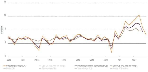 Source – Cleveland Federal Reserve What about sticky Rent inflation? While rent inflation is high and sticky, it has a substantial lag. Remember, as investors we want to be forward looking. Most market-based rent metrics are showing a rapid decline in actual rents. Even Fed Chair Jay Powell admitted to the lagging effect of rent inflation and is focused on real time data. Therefore, instead of 8% reading in the most recent report, the real-time reading is closer to 4% as shown in the chart 2. Chart 2 – Actual Rent Inflation and New Tenant Rent Estimat 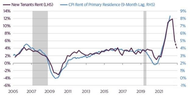 Source – Guggenheim Investments Sticky CPI ex rent at 2% A three-month annualized estimate is the leading-edge inflation estimate. To calculate this estimate, we look at month-over-month inflation for the past three months and multiply it by 4 for an annual number. Atlanta Fed Sticky CPI is a weighed basket of items that change prices relatively slowly. However – sticky CPI excluding rent (we know rent lags) – is almost at 2%. See chart 3. Chart 3 – Atlanta Fed Sticky CPI (white) and Sticky CPI ex rent (blue) 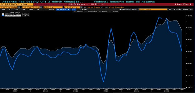 Source – Bloomberg CPI Projections The Fed missed the inflation call in 2021. To ensure that inflation isn’t entrenched, Chair Powell is willing to keep rates high until inflation gets closer to the 2% mandate. In December, month-over-month CPI decreased by -0.1%. If we were to keep that constant, year-over-year inflation will reach the Feds goal of 2% by April 2023. If we assume a month over month growth of 0.2% for the sake of conservatism, CPI will be under 2% by June of 2023. I’ll let you make your own assumptions. Chart 4 - Projections for CP 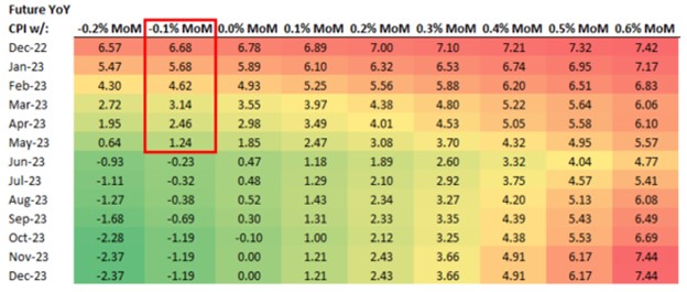 Source – Bespoke Research What does this mean for interest rates? Fed has a dual mandate: 1) inflation and 2) employment. Employment is still very strong because jobs are easy to get. Therefore, the Fed is laser focused on inflation. Historically, once the Fed funds rate moves above year-over-year CPI, the Fed knows they are fully in control. While we aren’t there yet (chart 5), based on the projections in chart 4, we know Fed will be well in control starting March 2023. Chart 5 – Fed Funds Rate and CPI 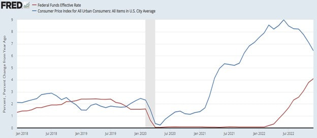 Source – Federal Reserve of St Louis What Are the Risks? While positive for growth, the base case impact of China reopening and stimulative policy is for the dollar to weaken, and for commodities to rise. This could reverse some components of declining inflation. Goods prices have collapsed over the past year. They will not keep falling at the same rate. They may even rise and offset the deflationary impact in other areas. Are We There Yet? What does it mean for the Fed? If history was a guide, the Fed would already be cutting interest rates. However, a once in a century pandemic and stimulus has changed the current calculus. Fed is more focused on inflation, and less on growth. Given the rapidly declining inflation, we are likely in the 9th inning of this rate increase cycle. The aftereffects of interest rate increases are felt with a lag. While job layoff announcements have risen, jobs are still easy to find. Starting in 2Q, unemployment claims will increase. With inflation well under control, Fed will likely focus on employment, its other mandate. The first step will be to announce a pause in rate hikes. Usually, rate cuts follow in six months. Post WW2, Fed has cut interest rates by 3% after a pause, and to a larger extent in the past two decades. Chart 6 – Historical Rate Cuts 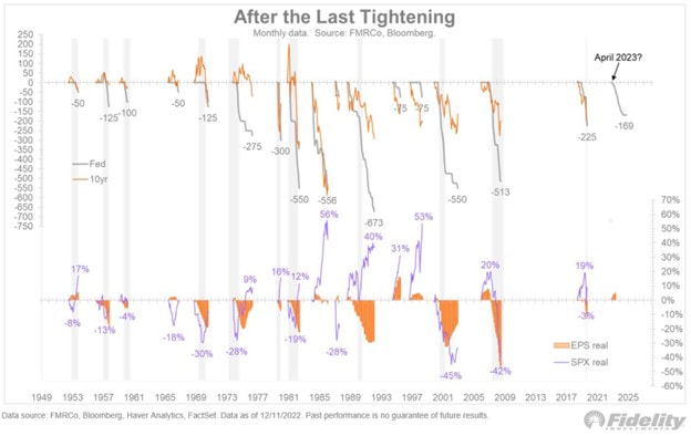 Source – Fidelity
What does this mean for the market? Stay tuned. --- This material does not constitute an offer or solicitation to purchase an interest in Latticework Partners, LP (the "Fund"). Such an offer will only be made by means of a confidential offering memorandum and only in those jurisdictions where permitted by law. An investment in the Fund is speculative and is subject to a risk of loss, including a risk of loss of principal. There is no secondary market for interests in the Fund and none is expected to develop. No assurance can be given that the Fund will achieve its objective or that an investor will receive a return of all or part of its investment. This material contains certain forward-looking statements and projections regarding the future performance and asset allocation of the Fund. These projections are included for illustrative purposes only, are inherently speculative as they relate to future events, and may not be realized as described. These forward-looking statements will not be updated in future. What differentiates a bear market rally from a durable market advance? Earnings, or fundamental do not make that list. They deteriorate well after the market bottoms. The answer is rate market breadth metrics. Here are a few that have raised the probability that the market is in the early innings of a durable market advance. 1) When the % of S&P stocks above 50 day moving average moves from <= 15% to >= 90% within 50 days, forward 12 month returns are above average 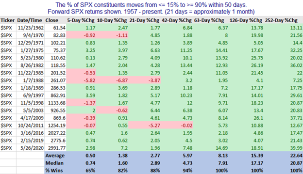 Source: Quantifiable Edges 2) When % of S&P stocks above 50 day moving average moves from < 10% to >= 85% over the past 20 years, forward 12 month returns are above average 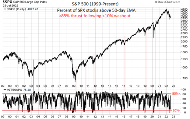 Source - Mark Ungewitter @mark_ungewitter 3) When S&P 500 has a 4 week win streak and gained 10% or more while below the all-time high weekly close, forward gains were positive in each case over next 12 weeks 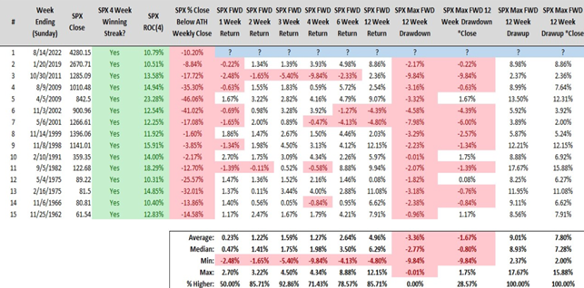 Source - Steve Deppe 4) When the S&P 500 gains 10%+ over 2 months with negative training 6 month returns, the forward 6 and 12 month returns are strong 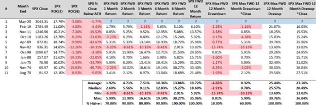 Source - Steve Deppe 5) When the % of stocks above their 50 day moving average crossed 55%, forward returns were positive 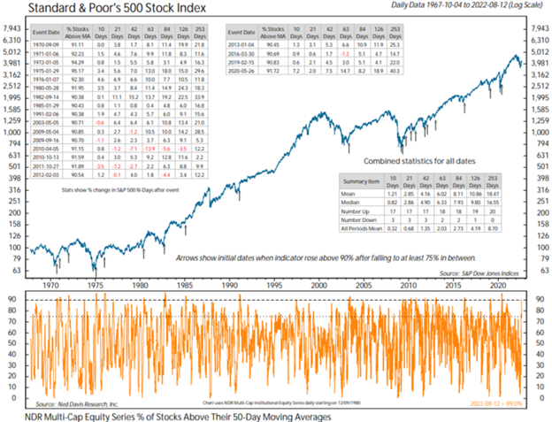 Source - Ned Davis Research, Renaissance Macro Research
Here are 5 charts that suggest that inflation has peaked and on its way to moderating over the coming 12 months 1) Record high retail inventories (look out for sales) 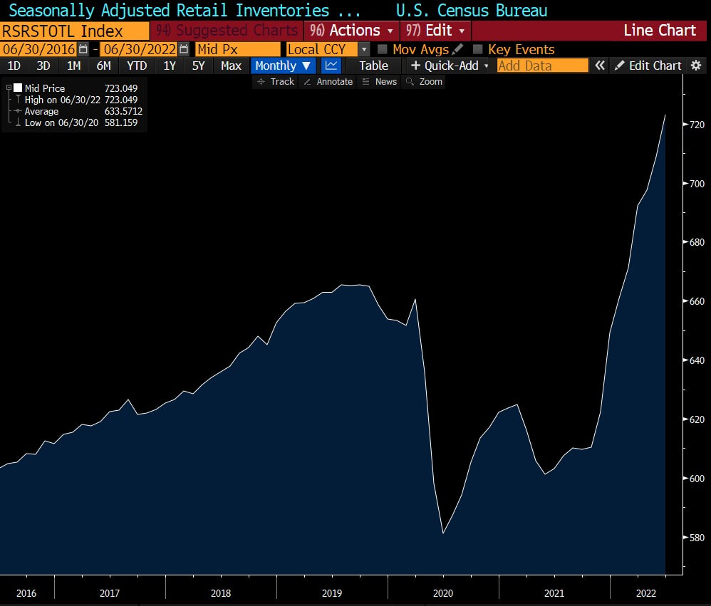 Source: Bloomberg 2) Decline in prices paid for manufactured goods 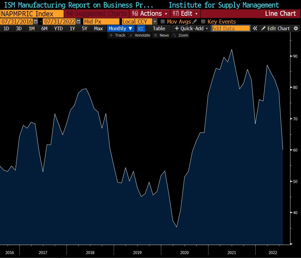 Source: Bloomberg 3) Decline in prices paid for services 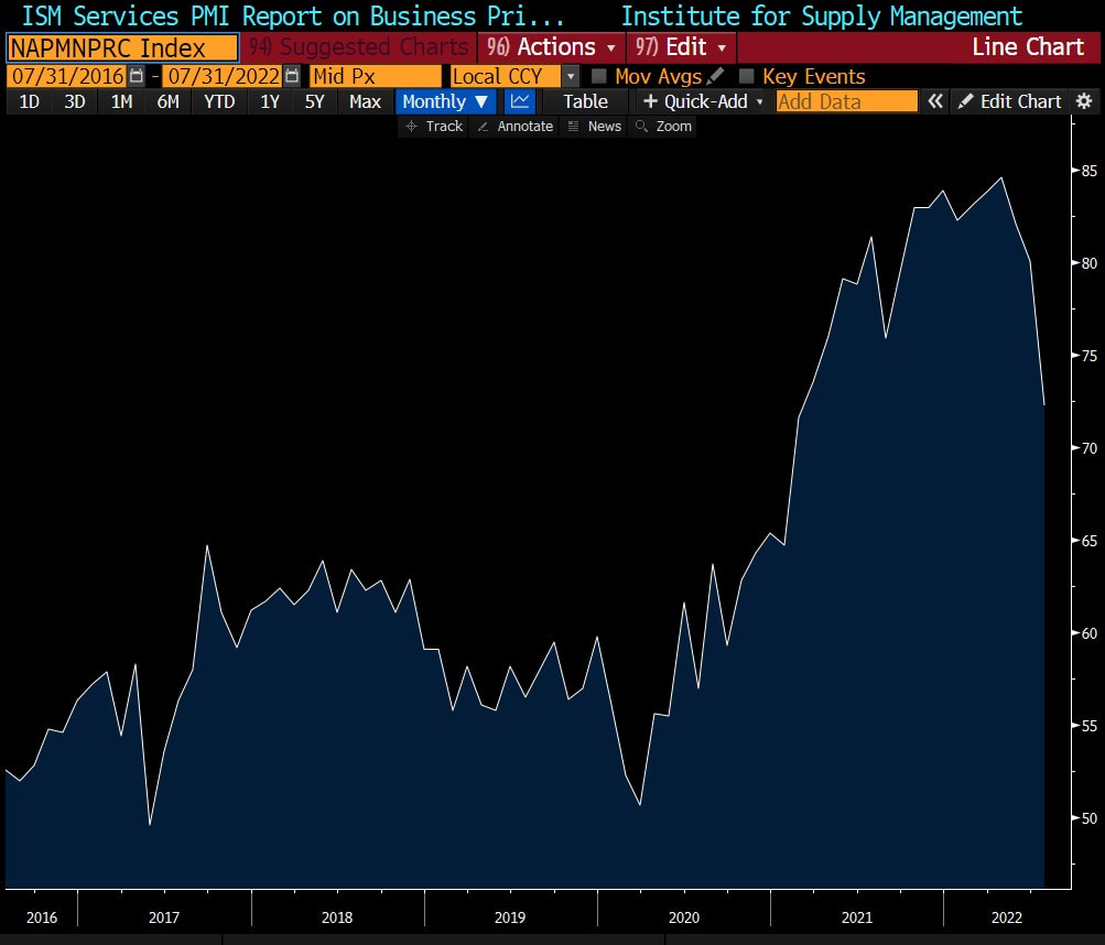 Source: Bloomberg 4) Reduction in supply chain bottlenecks 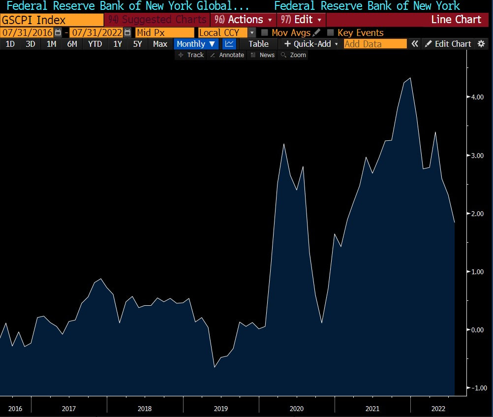 Source: Bloomberg 5) Decline in commodity prices  |